
곰
파이썬 데이터 시각화 본문
파이썬 시각화
차트 종류
1. Column/Bar chart : 데이터들 간 비교, 순위, 시계열분석
2. Dural Axis, 파레토 chart : 데이터들 간 비교, 순위, 파레토는 히스토그램의 일종
3. Pie chart : 전체 중 비율, 데이터들 간 비교
4. Line chart : 트렌드 파악/시계열 분석, 누적 비율
5. Scatter chart : 상관관계, 선형회귀
6. Bubble chart : Scatter chart의 변형, BCG Matrix
7. Heat map : 상관관계
8. Histogram : 분산
9. Box plot : 분산
10. Geo chart : 지역별 분산
 # 필요한 라이브러리 inport

  import pandas as pd
  import numpy as np

  import matplotlib.pyplot as plt # 시각화 라이브러리
  import seaborn as sns		  # 시각화 라이브러리

  from tqdm import tqdm_notebook  # for문 진행상황을 게이지로 표시

  #파이썬 warning 무시
  import warnings
  warnings.filterwarnings(action='ignore')
1. column 차트
part1. 참가자 많은 나이 순서대로 column chart 그리기
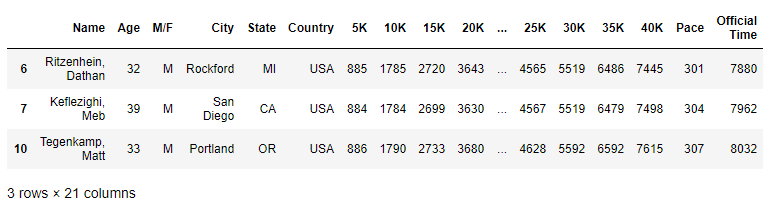
 marathon_2015_2017 = pd.read_csv('./data_boston/marathon_2015_2017.csv')

 # 미국인 데이터만 가져오기
 USA_runner= marathon_2015_2017[marathon_2015_2017.Country=='USA']

 print(USA_runner.shape)
 USA_runner.head(3)
(64474, 21)
USA_runner.info()<class 'pandas.core.frame.DataFrame'>
Int64Index: 64474 entries, 6 to 79637
Data columns (total 21 columns):
# Column Non-Null Count Dtype
--- ------ -------------- -----
0 Name 64474 non-null object
1 Age 64474 non-null int64
2 M/F 64474 non-null object
3 City 64474 non-null object
4 State 64474 non-null object
5 Country 64474 non-null object
6 5K 64474 non-null int64
7 10K 64474 non-null int64
8 15K 64474 non-null int64
9 20K 64474 non-null int64 1
....
20 Year 64474 non-null int64
dtypes: int64(16), object(5)
memory usage: 10.8+ MB
(1) State 별 runner 수
 # column 그래프 그리기(필수)
 plt.figure(figsize=(20, 10))                                # 그래프 크기
 runner_state = sns.countplot('State', data=USA_runner)      # 그래프 함수 : sns.countplot() 사용

 # column 그래프 부가 설명(옵션)
 runner_state.set_title('Number of runner by State - USA', fontsize=18)   # 제목
 runner_state.set_xlabel('State', fontdict={'size':16})                   # x축 이름
 runner_state.set_ylabel('Number of runner', fontdict={'size':16})        # y축 이름
 plt.show()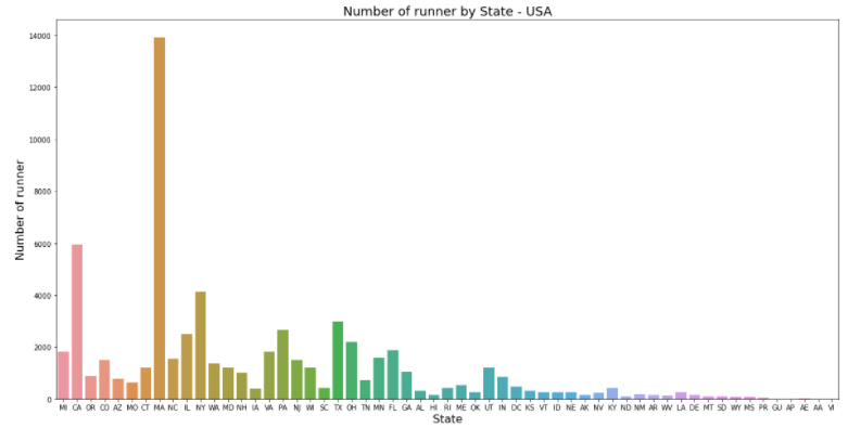
-> MA주가 가장 참가자 수가 많다. 남/녀 누가 더 많이 참가했을까?
(2) State, Gender 별 runner 수
 # column 그래프 그리기(필수)
 plt.figure(figsize=(20, 10))                                                                   # 그래프 크기
 runner_state = sns.countplot('State', data=USA_runner, hue='M/F', palette={'F':'y', 'M':'b'})  # 그래프 함수 : sns.countplot() 사용
                                                      # hue : 칼럼명 기준으로 데이터 구분해줌
 # column 그래프 부가 설명(옵션)
 runner_state.set_title('Number of runner by State, Gender - USA', fontsize=18)   # 제목
 runner_state.set_xlabel('State', fontdict={'size':16})                   # x축 이름
 runner_state.set_ylabel('Number of runner', fontdict={'size':16})        # y축 이름
 plt.show()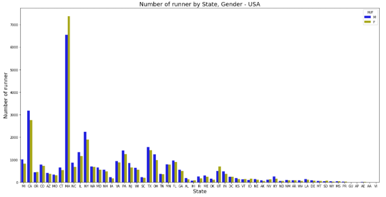
-> MA주는 여성들의 참여가 더 높다
년도별로 참가자 수를 보고 싶으면?
(3) 년도별 runner 수
 # column 그래프 그리기(필수)
 plt.figure(figsize=(20, 10))                                                                   # 그래프 크기
 runner_state = sns.countplot('State', data=USA_runner, hue='Year')  # 그래프 함수 : sns.countplot() 사용
                                                      # hue : 칼럼명 기준으로 데이터 구분해줌
 # column 그래프 부가 설명(옵션)
 runner_state.set_title('Number of runner by State, Year - USA', fontsize=18)   # 제목
 runner_state.set_xlabel('State', fontdict={'size':16})                   # x축 이름
 runner_state.set_ylabel('Number of runner', fontdict={'size':16})        # y축 이름
 plt.show()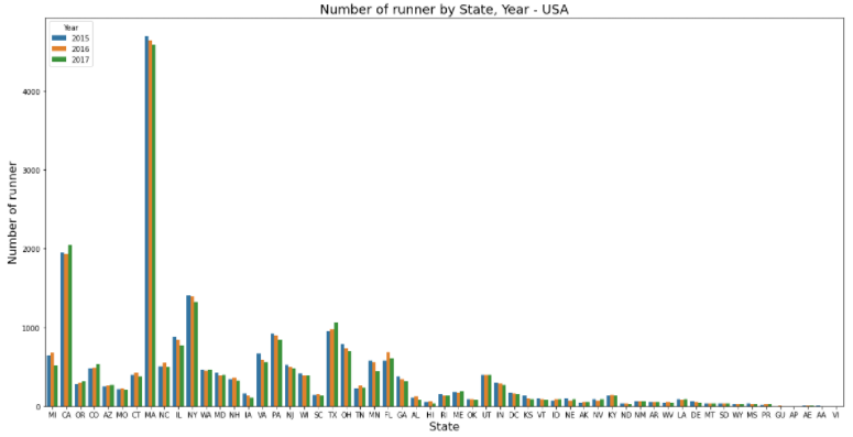
-> MA 주는 가장 참여자가 많은 주인데 매년 참가자 수가 줄고 있다. CA 주는 올해 참가자 수가 증가한 것으로 봐서 캠페인을 잘 한 것 같다.
2. Dual Axis, 파레토 차트
이타리아 학자 파레토가 부의 불균형을 설명하려고 만든 차트(80/20 rule)
데이터들 간 비교, 순위, 히스토그램에 사용됨
 import pandas as pd
 import matplotlib.pyplot as plt

 marathon_2015_2017 = pd.read_csv('./marathon_2015_2017.csv')

 #### 18세~59세 데이터만 가져오기 : isin()
 runner_18_59 = marathon_2015_2017[marathon_2015_2017.Age.isin(range(18, 60))]
 print(runner_18_59)
Name Age M/F City State Country 5K 10K \
0 Desisa, Lelisa 25 M Ambo NaN ETH 883 1783
1 Tsegay, Yemane Adhane 30 M Addis Ababa NaN ETH 883 1783
2 Chebet, Wilson 29 M Marakwet NaN KEN 883 1783
3 Kipyego, Bernard 28 M Eldoret NaN KEN 883 1784
4 Korir, Wesley 32 M Kitale NaN KEN 883 1784
... ... ... .. ... ... ... ... ...
79631 Leroy, Stefan M. 25 M Jupiter FL USA 2398 5153
79632 Quinn, Adam H. 19 M Belmont MI USA 2114 4233
79634 Avelino, Andrew R. 25 M Fayetteville NC USA 1923 3933
79635 Hantel, Johanna 57 F Malvern PA USA 3191 6216
79637 Rigsby, Scott 48 M Alpharetta GA USA 2376 4632
15K 20K ... 25K 30K 35K 40K Pace Official Time \
0 2697 3629 ... 4567 5520 6479 7359 296 7757
1 2698 3628 ... 4567 5519 6479 7362 298 7788
2 2697 3629 ... 4567 5520 6479 7381 299 7822
3 2701 3629 ... 4567 5520 6483 7427 300 7847
4 2698 3628 ... 4567 5520 6479 7407 300 7849
... ... ... ... ... ... ... ... ... ...
79631 7821 10867 ... 13986 17380 20571 23668 953 24971
79632 6470 9238 ... 14471 16979 19995 24171 972 25473
79634 6737 10181 ... 13819 17401 21228 24861 1000 26219
79635 9156 0 ... 15321 18397 21633 24878 1007 26377
79637 7210 10735 ... 16034 20233 23947 27683 1095 28694
Overall Gender Division Year
0 1 1 1 2015
1 2 2 2 2015
2 3 3 3 2015
3 4 4 4 2015
4 5 5 5 2015
... ... ... ... ...
79631 26405 14434 4772 2017
79632 26406 14435 4773 2017
79634 26408 14436 4774 2017
79635 26409 11973 698 2017
79637 26411 14438 2553 2017
[73608 rows x 21 columns]
 #### 18~59세 나이대별로 카운트 : value_counts()
 runner_18_59_counting = runner_18_59.Age.value_counts()
 runner_18_59_counting
45 3236
46 3039
40 2734
47 2566
50 2498
41 2494
35 2327
42 2318
48 2277
43 2265
36 2188
38 2128
51 2124
37 2108
39 2101
44 2056
49 2018
52 1930
55 1920
29 1906
30 1849
33 1834
31 1779
28 1758
34 1756
27 1755
53 1730
32 1726
26 1709
25 1539
56 1514
54 1433
24 1301
57 1287
58 1044
23 920
59 788
22 701
21 489
20 264
19 137
18 62
Name: Age, dtype: int64
x축 : Age 나열
 x = runner_18_59_counting.index

 print(type(x[0]))
 print(x)
<class 'numpy.int64'>
Int64Index([45, 46, 40, 47, 50, 41, 35, 42, 48, 43, 36, 38, 51, 37, 39, 44, 49, 52, 55, 29, 30, 33, 31, 28, 34, 27, 53, 32, 26, 25, 56, 54, 24, 57, 58, 23, 59, 22, 21, 20, 19, 18], dtype='int64')
 # int값을 str 값으로 바꾸기
 x = [str(i) for i in x]
 print(type(x[0]))
 print(x)
<class 'str'>
['45', '46', '40', '47', '50', '41', '35', '42', '48', '43', '36', '38', '51', '37', '39', '44', '49', '52', '55', '29', '30', '33', '31', '28', '34', '27', '53', '32', '26', '25', '56', '54', '24', '57', '58', '23', '59', '22', '21', '20', '19', '18']
y축 : 값 나열
 y = runner_18_59_counting.values
 print(type(y[0]))
 print(y)
<class 'numpy.int64'>
[3236 3039 2734 2566 2498 2494 2327 2318 2277 2265 2188 2128 2124 2108 2101 2056 2018 1930 1920 1906 1849 1834 1779 1758 1756 1755 1730 1726 1709 1539 1514 1433 1301 1287 1044 920 788 701 489 264 137 62]
 ratio = y/y.sum()
 ratio
array([0.04396261, 0.04128627, 0.0371427 , 0.03486034, 0.03393653, 0.03388219, 0.03161341, 0.03149114, 0.03093414, 0.03077111, 0.02972503, 0.0289099 , 0.02885556, 0.02863819, 0.02854309, 0.02793175, 0.0274155 , 0.02621998, 0.02608412, 0.02589392, 0.02511955, 0.02491577, 0.02416857, 0.02388327, 0.0238561 , 0.02384252, 0.02350288, 0.02344854, 0.02321759, 0.02090805, 0.02056842, 0.01946799, 0.01767471, 0.01748451, 0.01418324, 0.01249864, 0.01070536, 0.00952342, 0.0066433 , 0.00358657, 0.00186121, 0.0008423 ])
 # 누적데이터 보여주는 함수 : cumsum()
 ratio_sum = ratio.cumsum()
 ratio_sum
array([0.04396261, 0.08524889, 0.12239159, 0.15725193, 0.19118846, 0.22507064, 0.25668406, 0.2881752 , 0.31910934, 0.34988045, 0.37960548, 0.40851538, 0.43737094, 0.46600913, 0.49455222, 0.52248397, 0.54989947, 0.57611944, 0.60220356, 0.62809749, 0.65321704, 0.67813281, 0.70230138, 0.72618465, 0.75004076, 0.77388327, 0.79738615, 0.82083469, 0.84405228, 0.86496033, 0.88552875, 0.90499674, 0.92267145, 0.94015596, 0.9543392 , 0.96683784, 0.9775432 , 0.98706662, 0.99370992, 0.99729649, 0.9991577 , 1. ])
그래프 그리기
 # enumerate : index도 함께 보고 싶을 때 사용
 for i, data in enumerate(range(3, 14)):
    print(i, data)
0 3
1 4
2 5
3 6
4 7
5 8
6 9
7 10
8 11
9 12
10 13
 # figsize 지정
 fig, barChart = plt.subplots(figsize=(20,8))

 # bar chart에 x, y값 넣어서 bar chart 생성
 barChart.bar(x, y)

 # line chart 생성
 lineChart = barChart.twinx()  # twinx() : 두 개의 차트가 서로 다른 y 축, 공통 x 축을 사용하게 해줌
 lineChart.plot(x, ratio_sum, '-ro', alpha = 1)  # alpha:투명도
 # ^: 세모, s : sqaured, o : circle
 # g : green, b: blue, r: red

 ######## ------- 잘라서 보여주기 -------- ########

 # 오른쪽 축(라인 차트 축) 레이블
 ranges = lineChart.get_yticks() # y차트의 단위들
 lineChart.set_yticklabels(['{0:0.1%}'.format(x) for x in ranges]) # 오른쪽 단위 0.1% 소수점 한 자리까지

 # 라인차트 데이터 별 %값 주석(annotation)
 ratio_sum_percentages = ['{0:.0%}'.format(x) for x in ratio_sum]
 for i, txt in enumerate(ratio_sum_percentages):
    lineChart.annotate(txt, (x[i], ratio_sum[i]), fontsize=12)

 # x, y label만들기
 barChart.set_xlabel('Age', fontdict={'size':16})
 barChart.set_ylabel('Number of runner', fontdict={'size':16})

 # plot에 title 만들기
 plt.title('Pareto Chart - Number of runner by Age', fontsize=18)


 plt.show()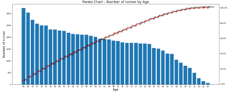
-> 파레토 차트로 직관적으로 상위 n%를 확인할 수 있다
part2. 나이 순서대로 정렬해서 그래프 그리기
 import pandas as pd
 import matplotlib.pyplot as plt

 marathon_2015_2017 = pd.read_csv('./marathon_2015_2017.csv')
 #### 18세~59세 데이터만 가져오기 : isin() : 컬럼에서 어떤 특정 값을 포함하고 있는것만 걸러낼 때
 runner_18_59 = marathon_2015_2017[marathon_2015_2017.Age.isin(range(18, 60))]
 # print(runner_18_59)

 #### 18~59세 나이대별로 카운트 : value_counts()
 runner_18_59_counting = runner_18_59.Age.value_counts()
 # print(runner_18_59_counting)
나이와 참가자 수 각각 데이터프레임에 칼럼 추가 -> Age를 이용한 sort 가능
 runner_age = pd.DataFrame({
    'Age': runner_18_59_counting.index,
    'Count': runner_18_59_counting
 })

 runner_age_sort = runner_age.sort_values(by='Age')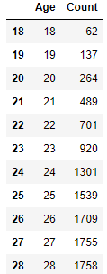
 # runner_age_sort 값 기준
 x = runner_age_sort.index
 # int값을 str 값으로 바꾸기
 x = [str(i) for i in x]

 # y값도 변경
 y = runner_age_sort['Count']

 # 누적데이터 보여주는 함수 : cumsum()
 ratio = y/y.sum()
 ratio_sum = ratio.cumsum()
 print(ratio_sum)

 # y 누적값을 리스트 형식으로 바꿔주기
 y_ratio = [i for i in ratio_sum]
 print(y_ratio)
18 0.000842
19 0.002704
20 0.006290
21 0.012933
.......
56 0.957627
57 0.975111
58 0.989295
59 1.000000
Name: Count, dtype: float64
[0.0008422997500271709, 0.0027035104879904355, 0.0062900771655254855, 0.012933376806868818, 0.02245679817411151, 0.0349554396261276, 0.05263014889685904, 0.07353820236930769, 0.09675578741441149, 0.12059830453211609, 0.14448157808933815, 0.17037550266275409, 0.19549505488533858, 0.21966362351918273, 0.24311216172155203, 0.2680279317465493, 0.29188403434409305, 0.32349744592979024, 0.3532224758178459, 0.3818606673187697, 0.41077056841647647, 0.43931366155852625, 0.47645636343875664, 0.5103385501575916, 0.5418296924247364, 0.5726008042604065, 0.6005325508096946, 0.6444951635691772, 0.6857814368003478, 0.7206417780676013, 0.7515759156613412, 0.7789914139767417, 0.8129279426149332, 0.8417835017932833, 0.8680034778828388, 0.8915063580045647, 0.9109743506140636, 0.9370584719052276, 0.9576268883816975, 0.9751114009346808, 0.9892946418867513, 0.9999999999999999]
 # 데이터 그리기

 # figsize 지정
 fig, barChart = plt.subplots(figsize=(20,10))

 # bar chart에 x, y값 넣어서 bar chart 생성
 barChart.bar(x, y)

 # line chart 생성
 lineChart = barChart.twinx()
 lineChart.plot(x, ratio_sum, '-g^', alpha = 0.5)  # alpha:투명도

 # 오른쪽 축(라인 차트 축) 레이블
 ranges = lineChart.get_yticks() # y차트의 단위들
 lineChart.set_yticklabels(['{0:.1%}'.format(x) for x in ranges])

 # 오른쪽 축(라인 차트 축) 레이블
 ranges = lineChart.get_yticks() # y차트의 단위들
 lineChart.set_yticklabels(['{0:.1%}'.format(x) for x in ranges])

 # 라인차트 데이터 별 %값 주석(annotation)
 ratio_sum_percentages = ['{0:.0%}'.format(x) for x in ratio_sum]
 for i, txt in enumerate(ratio_sum_percentages):
    lineChart.annotate(txt, (x[i], y_ratio[i]), fontsize=12)  #변경된 부분: ratio_sum -> y_ratio

 # x, y label, title 만들기
 barChart.set_xlabel('Age', fontdict={'size':16})
 barChart.set_ylabel('Number of runner', fontdict={'size':16})
 plt.title('Dual Axis Chart - Number of runner by Age', fontsize=18)  # 제목 변경(dual axis chart)

 # show plot
 plt.show()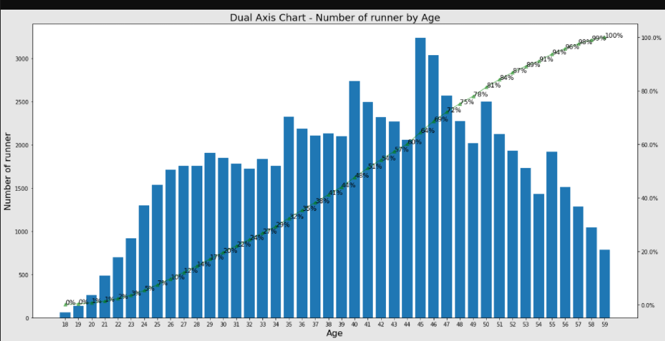
3. Pie chart
전체 100% 중 각 segment들이 차지르하는 비율
 import pandas as pd
 import numpy as np
 import matplotlib.pyplot as plt

 marathon_2015_2017 = pd.read_csv('./marathon_2015_2017.csv')

 # 튜플 형태로 라벨 지정
 labels = 'Male', 'Female'
 labels
('Male', 'Female')
 # 차트를 입체적으로 보이게
 explode = (0, 0.5)

 marathon_2015_2017.columns
Index(['Name', 'Age', 'M/F', 'City', 'State', 'Country', '5K', '10K', '15K', '20K', 'Half', '25K', '30K', '35K', '40K', 'Pace',
'Official Time', 'Overall', 'Gender', 'Division', 'Year'],
dtype='object')
marathon_2015_2017['M/F'].value_counts()M 43482
F 36156
Name: M/F, dtype: int64
 plt.figure(figsize=(7,7))

 # pie chart 만들기(차트 띄우기, labels 달기, 각 조정, 그림자, 값 소숫점 표시)
 plt.pie(marathon_2015_2017['M/F'].value_counts(), explode=(0, 0.05), labels=labels, startangle=90, shadow=True, autopct='%.2f')

 # 라벨, 타이틀 달기
 plt.title('Male vs Female', fontsize=18)

 # 레전드 달기
 plt.legend(['Male', 'Female'], loc='upper right') # 오른쪽 위의 표시사항

 plt.show()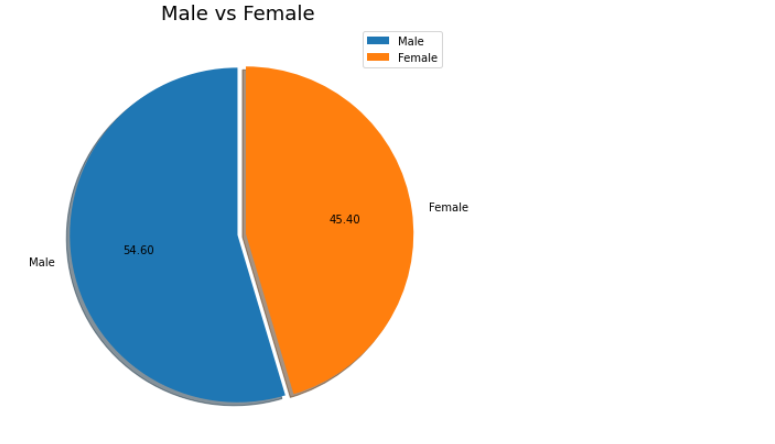
4. Line chart
트렌드 파악, 시계열 분석에 사용됨. 주로 시간 순서에 따른 추이를 확인
 import pandas as pd
 import matplotlib.pyplot as plt

 marathon_2015_2017.head(3)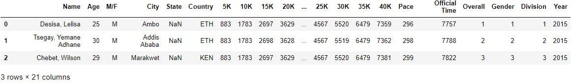
필요한 칼럼만 가져와서 데이터프레임으로 만들기
 record = pd.DataFrame(marathon_2015_2017, columns=['5K','10K','15K','20K','Half','25K','30K','35K','40K','Official Time']).sort_values(
 by=['Official Time'])

 record.head()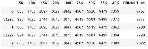
칼럼 추가하기 : insert() - 값을 위치를 지정해서 추가하는 함수
 record.insert(0, 'Rank', range(1, len(record)+1))
 record.head(100)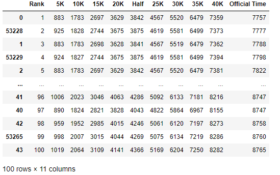
100등까지만 가져오기
 top100 = record[0:100]
 top100
 yData_full = top100['Official Time']
 yData_10K = top100['10K']
 yData_20K = top100['20K']
 yData_30K = top100['30K']
Line chart 그리기
 plt.figure(figsize=(20, 10))

 plt.plot(xData, yData_full, 's')
 plt.plot(xData, yData_30K, '-')
 plt.plot(xData, yData_20K)
 plt.plot(xData, yData_10K) # . 점선/ - 선/ ^ 세모/ o 원/ s네모

 # 레전드 달기
 plt.legend(['Full', '30K', '20K', '10K'], loc='upper left')

 plt.show()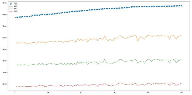
5. Scatter chart
변수 간 상관관계(correlation), 머신러닝- 선형회귀
 marathon_2015_2017 = pd.read_csv('./marathon_2015_2017.csv')

 MALE_runner = marathon_2015_2017[marathon_2015_2017['M/F']=='M']
 FEMALE_runner = marathon_2015_2017[marathon_2015_2017['M/F']=='F']

 FEMALE_runner.head()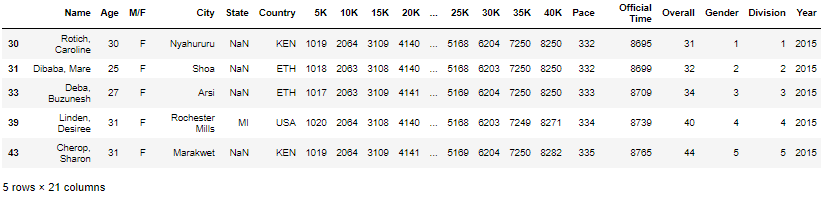
 x_male = MALE_runner.Age
 y_male = MALE_runner['Official Time']

 x_female = FEMALE_runner.Age
 y_female = FEMALE_runner['Official Time']
Scatter chart 그리기
 # figure size 지정
 plt.figure(figsize=(20, 20))

 plt.plot(x_male, y_male, '.', color='b', alpha=0.5)
 plt.plot(x_female, y_female, '.', color='r', alpha=0.5)

 # label과 title 정하기
 plt.xlabel('Age', fontsize=30)
 plt.ylabel('Official Time(second)', fontsize=30)
 plt.title('Distribution by Running time and Age', fontsize=30)

 plt.legend(['Male', 'Female'], loc='upper left') # 범례

 plt.show()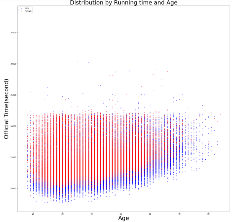
6. Bubble chart
버블 사이즈를 통행 데이터의 양을 보여줌, scatter chart에서 변형된 형태
 marathon_results_2017 = pd.read_csv('./marathon_results_2017.csv')

 marathon_2017 = marathon_results_2017.drop(['Unnamed: 0', 'Bib', 'Citizen', 'Unnamed: 9', 'Proj Time'], axis='columns')

 marathon_2017.head()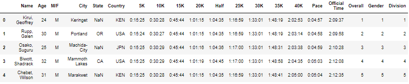
초 단위로 바꾸기 : to_timedelta
 # pd.to_timedelt() 적용하기
 # .astype('m8[s]').astype(np.int64) 적용하기
 # -> 초단위로 바꾼 후, int 형태로 변환
 marathon_2017['5K'] = pd.to_timedelta(marathon_2017['5K']).astype('m8[s]').astype(np.int64)
 marathon_2017['10K'] = pd.to_timedelta(marathon_2017['10K']).astype('m8[s]').astype(np.int64)
 marathon_2017['15K'] = pd.to_timedelta(marathon_2017['15K']).astype('m8[s]').astype(np.int64)
 marathon_2017['20K'] = pd.to_timedelta(marathon_2017['20K']).astype('m8[s]').astype(np.int64)
 marathon_2017['Half'] = pd.to_timedelta(marathon_2017['Half']).astype('m8[s]').astype(np.int64)
 marathon_2017['25K'] = pd.to_timedelta(marathon_2017['25K']).astype('m8[s]').astype(np.int64)
 marathon_2017['30K'] = pd.to_timedelta(marathon_2017['30K']).astype('m8[s]').astype(np.int64)
 marathon_2017['35K'] = pd.to_timedelta(marathon_2017['35K']).astype('m8[s]').astype(np.int64)
 marathon_2017['40K'] = pd.to_timedelta(marathon_2017['40K']).astype('m8[s]').astype(np.int64)
 marathon_2017['Pace'] = pd.to_timedelta(marathon_2017['Pace']).astype('m8[s]').astype(np.int64)
 marathon_2017['Official Time'] = pd.to_timedelta(marathon_2017['Official Time']).astype('m8[s]').astype(np.int64)

 marathon_2017.head(10)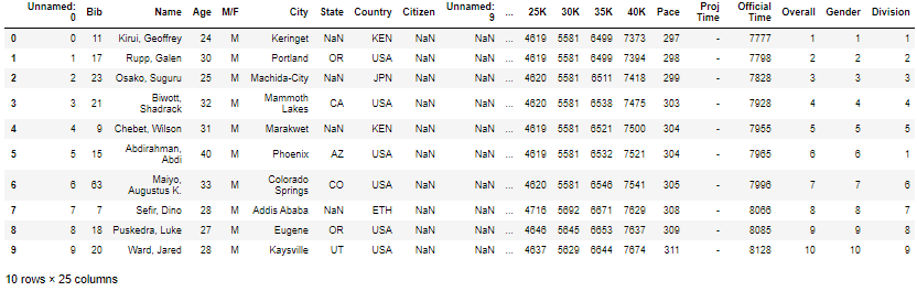
 check_time = 7200    # 2시간
 Lat = 0  # 초기값
 Long = 0 # 초기값
 Location = ''

 # 5K, 10K, 15K, 20K, 25K, 30K, 35K, 40K
 points = [[42.247835,-71.474357], [42.274032,-71.423979], [42.282364,-71.364801], [42.297870,-71.284260],
           [42.324830,-71.259660], [42.345680,-71.215169], [42.352089,-71.124947], [42.351510,-71.086980]]
marathon_location = pd.DataFrame(columns=['Lat','Long'])
marathon_location
marathon_2017.tail()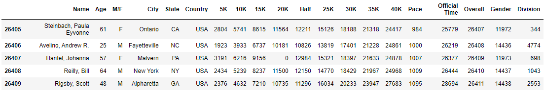
 from tqdm import tqdm_notebook

 #time
 # 26000개 행을 돌면서 위치가 어디인지 판단한다.
 # iterrows() : 각각의 행을 돌아라는 뜻
 for index, record in tqdm_notebook(marathon_2017.iterrows()): # 각각 참가자들에 대해서
    if (record['40K'] < check_time):
        Lat = points[7][0]
        Long = points[7][1]
    elif (record['35K'] < check_time):
        Lat = points[6][0]
        Long = points[6][1]
    elif (record['30K'] < check_time):
        Lat = points[5][0]
        Long = points[5][1]
    elif (record['25K'] < check_time):
        Lat = points[4][0]
        Long = points[4][1]
    elif (record['20K'] < check_time):
        Lat = points[3][0]
        Long = points[3][1]
    elif (record['15K'] < check_time):
        Lat = points[2][0]
        Long = points[2][1]
    elif (record['10K'] < check_time):
        Lat = points[1][0]
        Long = points[1][1]
    elif (record['5K'] < check_time):
        Lat = points[0][0]
        Long = points[0][1]
    else:
        Lat = points[0][0]
        Long = points[0][1]
    marathon_location = marathon_location.append({'Lat' : Lat, 'Long' : Long}, ignore_index=True)
print(len(marathon_location))
marathon_location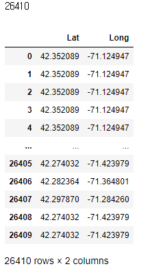
marathon_location.groupby(['Lat', 'Long']).size()Lat Long
42.274032 -71.423979 49
42.282364 -71.364801 4435
42.297870 -71.284260 13866
42.324830 -71.259660 7261
42.345680 -71.215169 737
42.351510 -71.086980 6
42.352089 -71.124947 56
dtype: int64
 marathon_count = marathon_location.groupby(['Lat', 'Long']).size().reset_index(name='Count')
 marathon_count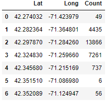
-> 2시간 정도 지났을 때, 참가자들은 7개 정도 지역에 분포되어 있다
Bubble chart(지도) 그리기 : scatter chart의 응용버전
 import matplotlib.pyplot as plt

 # figure size 지정
 plt.figure(figsize=(20, 10))

 # scatter chart 적용, s : 분포 동그라미
 plt.scatter(marathon_count.Lat, marathon_count.Long, s=marathon_count.Count, alpha=0.5)

 # 타이틀, 라벨 달기

 plt.title('Runners location at 2nd hours')
 plt.xlabel('Latitude')
 plt.ylabel('Longitude')

 # 위치 별 Count값 넣기
 for i, txt in enumerate(marathon_count.Count):
    plt.annotate(txt, (marathon_count.Lat[i], marathon_count.Long[i]), fontsize=20)

 plt.show()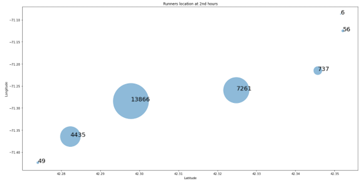
7. Heat map
여러 변수 간의 상관관계를 색으로 보여주거나, 값의 높고 낮음을 색으로 진하기로 보여줌
 marathon_2015_2017 = pd.read_csv('./marathon_2015_2017.csv')

 import pandas as pd
 import matplotlib.pyplot as plt
 import seaborn as sns
 sns.set()

 marathon_2015_2017_under60 = marathon_2015_2017[marathon_2015_2017.Age.isin(range(0, 60))]
marathon_2015_2017_under60.groupby('Age')['M/F'].value_counts()Age M/F
18 M 32
F 30
19 F 70
M 67
20 F 139
...
57 F 387
58 M 741
F 303
59 M 564
F 224
Name: M/F, Length: 84, dtype: int64
 marathon = marathon_2015_2017_under60.groupby('Age')['M/F'].value_counts().unstack().fillna(0)
 marathon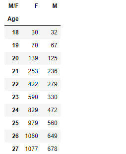
 f, ax = plt.subplots(figsize=(10,20))
 sns.heatmap(marathon, annot=True, fmt='d', linewidths=1, ax=ax)  # cmap='Accent'
 plt.show()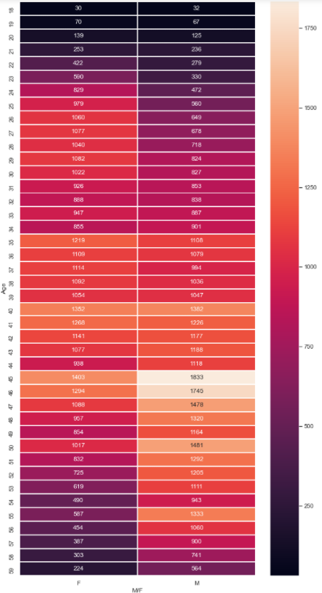
8. Histogram
 import pandas as pd
 import matplotlib.pyplot as plt
 import seaborn as sns

 marathon_2015_2017 = pd.read_csv('./marathon_2015_2017.csv')

 print(marathon_2015_2017.shape)
 marathon_2015_2017.head(3)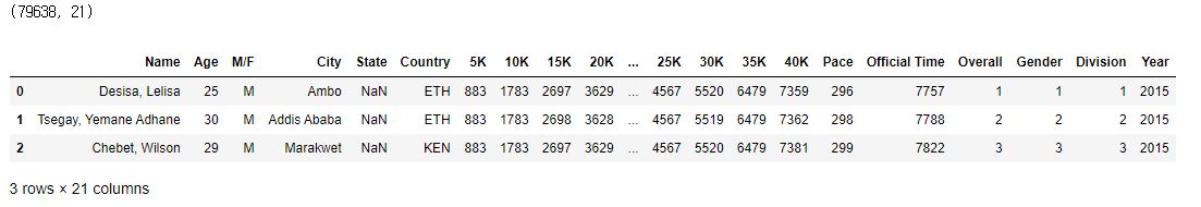
(1) 나이별 참가자 비율 분포 구하기 : 씨본의 distplot
 # figure size 지정
 plt.figure(figsize = (20, 10))

 # displot 함수로 분포 그리기
 age_count = sns.distplot(marathon_2015_2017.Age)

 # 제목, x라벨 ,y라벨 지정
 age_count.set_title('Distribution Rate by Ages', fontsize=18)
 age_count.set_xlabel('Ages', fontdict={'size':16})
 age_count.set_xlabel('Distibution Rate', fontdict={'size':16})

 plt.show()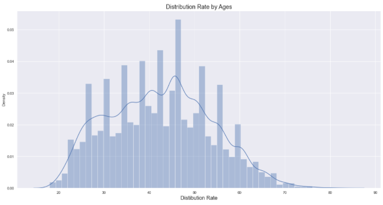
(2) 나이별 참가자 실제 수 그리기 : 씨본의 countplot
 # figure size 지정
 plt.figure(figsize = (20, 10))

 # displot 함수로 분포 그리기
 age_count = sns.countplot(marathon_2015_2017.Age)

 # 제목, x라벨 ,y라벨 지정
 age_count.set_title('Distribution by Ages', fontsize=18)
 age_count.set_xlabel('Ages', fontdict={'size':16})
 age_count.set_xlabel('Distibution Rate', fontdict={'size':16})

 plt.show()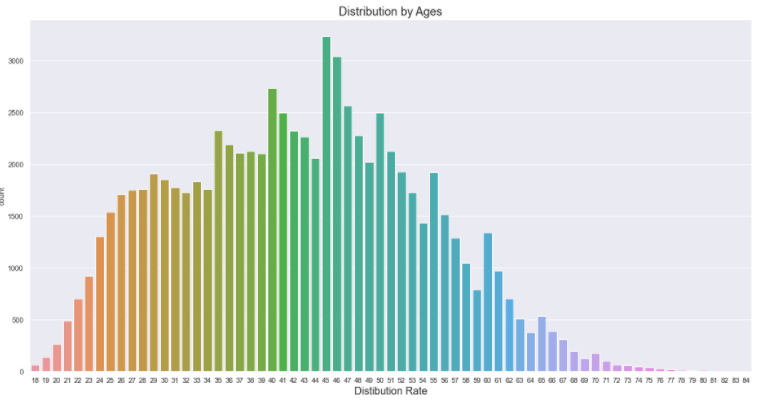
(3) 카운트가 높은 연령 기준으로 실제 수 그리기 : 씨본의 countplot 응용
 # figure size 지정
 plt.figure(figsize = (20, 10))

 # displot 함수로 분포 그리기
 # 카운트가 높은 연령 기준으로 : value_counts와 index 메소드를 이용해서
 age_count = sns.countplot('Age', data=marathon_2015_2017, order=marathon_2015_2017['Age'].value_counts().index) # order : 정렬, value_counts().index는 연령별 인원

 # 제목, x라벨 ,y라벨 지정
 age_count.set_title('Distribution by Ages sorted', fontsize=18)
 age_count.set_xlabel('Ages', fontdict={'size':16})
 age_count.set_xlabel('Distibution Rate', fontdict={'size':16})

 plt.show()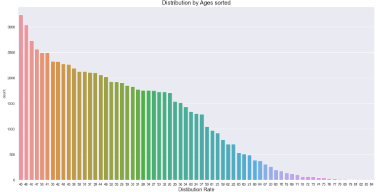
9. Box plot
 # 필요한 라이브러리 임포트
 import pandas as pd # 데이터 분석 라이브러리
 import numpy as np  # 숫자, 행렬

 import matplotlib.pyplot as plt  # 시각화
 import seaborn as sns            # 시간화

 from tqdm import tqdm_notebook   # for진행상황
marathon_2015_2017 = pd.read_csv('./marathon_2015_2017.csv')
print(marathon_2015_2017.shape)
marathon_2015_2017.head(3)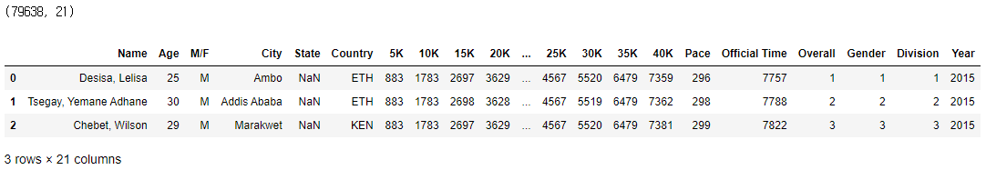
미국인 참가자만 가져오기
 USA_runner = marathon_2015_2017[marathon_2015_2017.Country =='USA']

 print(USA_runner.shape)
 USA_runner.head(3)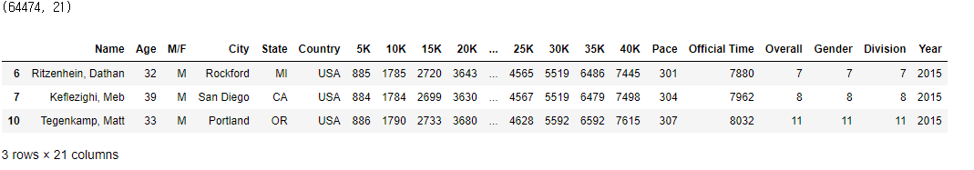
 # 남녀 구분해서 데이터 저장
 USA_MALE_runner = USA_runner[USA_runner['M/F'] == 'M']
 USA_FEMALE_runner = USA_runner[USA_runner['M/F'] == 'F']

 USA_MALE_runner.head(3)
 # figure size 정하기
 plt.figure(figsize=(10, 5))

 # 씨본의 스타일 지정
 sns.set(style='ticks', palette = 'pastel') # style = "ticks", "whitegrid"   / palette = "pastel", "Set3"

 # 박스플롯 그리기
 sns.boxplot(x='M/F', y="Pace", palette=['b', 'r'], data=USA_runner)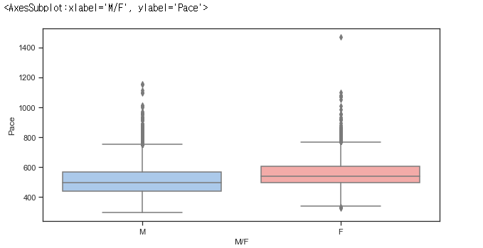
실제 통계치 확인
 USA_MALE_runner_stat = USA_MALE_runner['Pace'].describe()
 USA_MALE_runner_stat
count 33390.00000
mean 514.22944
std 97.99571
min 298.00000
25% 442.00000
50% 495.00000
75% 566.00000
max 1157.00000
Name: Pace, dtype: float64
 USA_FEMALE_runner_stat = USA_FEMALE_runner['Pace'].describe()
 USA_FEMALE_runner_stat
count 31084.000000
mean 561.858448
std 88.425649
min 328.000000
25% 499.000000
50% 541.000000
75% 607.000000
max 1470.000000
Name: Pace, dtype: float64
10. Geo chart with Folium
Folium 은 'Open Street Map'과 같은 지도데이터에 'Leaflet.js'를 이용하여 위치정보를 시각화 하기 위한 라이브러리
 import pandas as pd

 marathon_2017 = pd.read_csv('marathon_results_2017.csv')

 marathon_2017.loc[:, '10K':'Pace']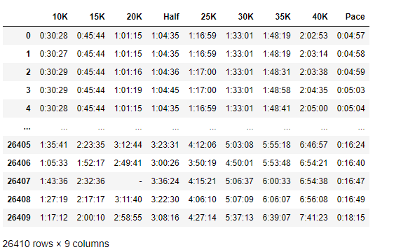
 print(marathon_results_2017.shape)
 marathon_2017.head(5)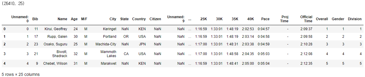
 # for문 사용 안하는 방식
 marathon_2017['5K'] = pd.to_timedelta(marathon_2017['5K']).astype('m8[s]').astype(np.int64)
 marathon_2017['15K'] = pd.to_timedelta(marathon_2017['15K']).astype('m8[s]').astype(np.int64)
 marathon_2017['20K'] = pd.to_timedelta(marathon_2017['20K']).astype('m8[s]').astype(np.int64)
 marathon_2017['25K'] = pd.to_timedelta(marathon_2017['25K']).astype('m8[s]').astype(np.int64)
 marathon_2017['Half'] = pd.to_timedelta(marathon_2017['Half']).astype('m8[s]').astype(np.int64)
 marathon_2017['30K'] = pd.to_timedelta(marathon_2017['30K']).astype('m8[s]').astype(np.int64)
 marathon_2017['35K'] = pd.to_timedelta(marathon_2017['35K']).astype('m8[s]').astype(np.int64)
 marathon_2017['40K'] = pd.to_timedelta(marathon_2017['40K']).astype('m8[s]').astype(np.int64)
 marathon_2017['Pace'] = pd.to_timedelta(marathon_2017['Pace']).astype('m8[s]').astype(np.int64)
 marathon_2017['Official Time'] = pd.to_timedelta(marathon_2017['Official Time']).astype('m8[s]').astype(np.int64)

 marathon_2017.loc[:, '10K':'Pace']
 import numpy as np

 # pd.to_timedelt() 적용하기
 # .astype('m8[s]').astype(np.int64) 적용하기 : 초 단위로 바꾼 후, int 형태로 변환

 points = ['5K', '10K', '15K', '20K', 'Half', '25K', '30K', '35K', '40K', 'Pace', 'Official Time']
 for point in points:
    marathon_2017[point] = pd.to_timedelta(marathon_2017[point]).astype('m8[s]').astype(np.int64)

 # 시간 데이터가 int 형태로 바뀌었는지 확인
 marathon_2017.loc[:, '10K':'Pace'].head(10)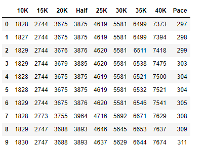
 # 참가자별 위치 파악하기
 check_time = 7200    # 2시간
 Lat = 0
 Long = 0
 Location = ''

 # 5K, 10K, 15K, 20K, 25K, 30K, 35K, 40K
 points = [[42.247835,-71.474357], [42.274032,-71.423979], [42.282364,-71.364801], [42.297870,-71.284260],
          [42.324830,-71.259660], [42.345680,-71.215169], [42.352089,-71.124947], [42.351510,-71.086980]]
%%time
# 26000개 행을 돌면서 위치가 어디인지 판단한다.
# iterrows() : 각각의 행을 돌아라는 뜻
marathon_location = pd.DataFrame(columns=['Lat','Long'])
for index, record in marathon_2017.iterrows():
if (record['40K'] < check_time):
Lat = points[7][0]
Long = points[7][1]
elif (record['35K'] < check_time):
Lat = points[6][0]
Long = points[6][1]
elif (record['30K'] < check_time):
Lat = points[5][0]
Long = points[5][1]
elif (record['25K'] < check_time):
Lat = points[4][0]
Long = points[4][1]
elif (record['20K'] < check_time):
Lat = points[3][0]
Long = points[3][1]
elif (record['15K'] < check_time):
Lat = points[2][0]
Long = points[2][1]
elif (record['10K'] < check_time):
Lat = points[1][0]
Long = points[1][1]
elif (record['5K'] < check_time):
Lat = points[0][0]
Long = points[0][1]
else:
Lat = points[0][0]
Long = points[0][1]
marathon_location = marathon_location.append({'Lat' : Lat, 'Long' : Long}, ignore_index=True)Wall time: 35.9 s
 print(marathon_location.shape)
marathon_location.head(10) 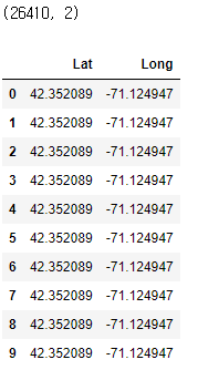
 marathon_count = marathon_location.groupby(['Lat', 'Long']).size().reset_index(name='Count')
 marathon_count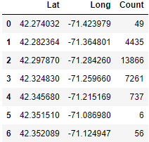
 import matplotlib.pyplot as plt

 # figure size 지정
 plt.figure(figsize=(20, 10))

 # scatter chart 적용
 plt.scatter(marathon_count.Lat, marathon_count.Long, s=marathon_count.Count, alpha=0.5)

 # 타이틀, 라벨 달기
 plt.title('Runners location at 2nd hours')
 plt.xlabel('Latitude')
 plt.ylabel('Longitude')

 # 위치 별 Count값 넣기
 for i, txt in enumerate(marathon_count.Count):
    plt.annotate(txt, (marathon_count.Lat[i], marathon_count.Long[i]), fontsize=18)

 plt.show()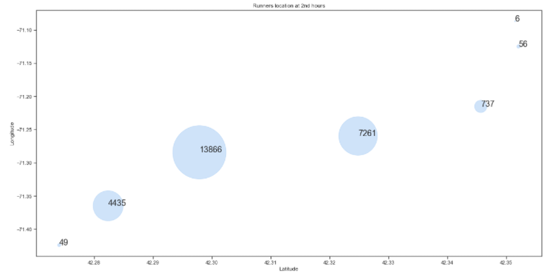
Folium을 이용해서 지도 위에 그리기
!pip install folium
# 다운로드
import folium
from folium.plugins import HeatMap
# Folium marathon map 그리기
marathon_map = folium.Map(location=[42.324830, -71.259660],
tiles='cartodbdark_matter',
zoom_start=11)
# 지도 타일 형태 # tiles='Stamen Toner', 'Stamen Terrain', 'OpenStreetMap'
HeatMap(marathon_count, radius=20).add_to(marathon_map)<folium.plugins.heat_map.HeatMap at 0x12dd880bd30>
marathon_map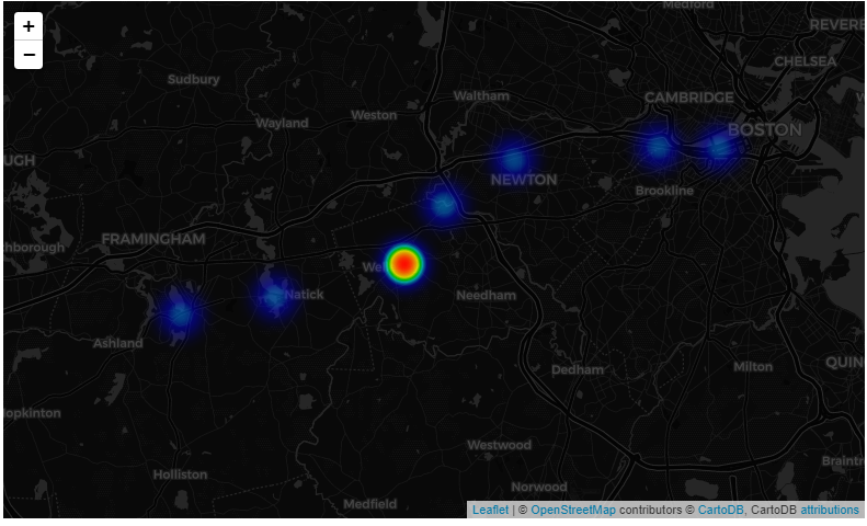
folium - tiles에 적용할 수 있는 곳
https://python-graph-gallery.com/288-map-background-with-folium/
'파이썬 응용' 카테고리의 다른 글
| 파이썬 마라톤 데이터 활용(marathon) (0) | 2021.04.30 |
|---|
